UI Widgets (FmrbUI)
A small widget set for apps that draw their own window. Apps used to build their own button tables, hit tests and pressed-state drawing; this holds one copy of that.
def on_create
  @ui = FmrbUI.new(self)
  @ui.label(:title, 0, 0, 108, 10, "Motif")
  @ui.toggle(:round, 0, 12, 50, 16, "Round", group: :motif, on: true)
  @ui.toggle(:diamond, 58, 12, 50, 16, "Diamond", group: :motif)
  @ui.button(:save, 0, 34, 108, 14, "Save")
  @ui.flush
end

def on_event(ev)
  super
  case @ui.handle(ev)
  when :round, :diamond then redraw
  when :save then save
  end
  @ui.flush
end
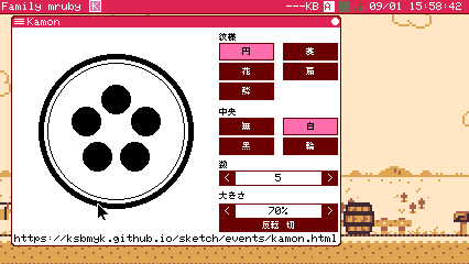
The Kamon demo's panel: labels, two groups of toggles, and steppers with a unit
Two rules it is built around
Nothing is allocated in the steady state. Widgets are made in on_create; the event and
redraw paths allocate nothing at all.
Nothing is drawn per frame. Each widget carries a dirty flag, and flush draws only those —
calling present once, and not at all when nothing was dirty.
The box
FmrbUI.new(app, bg: …, text_size: 1, bg_painter: nil)
Pass the app itself. The canvas and the user-area origin are read from it, so widget coordinates are relative to the user area.
| Argument | |
|---|---|
bg: |
The colour a widget paints inside itself — a Label's box, a Stepper's value field, a Scrollbar's track. Defaults to the window background |
text_size: |
The default scale for the widgets made from here on. A widget can override it with its own text_size: |
bg_painter: |
Who repaints the ground where a widget used to be |
Left out, the hole a hidden widget leaves is filled with bg:, which is right while the
ground is one colour. Where the ground is a picture — a wallpaper, a border, a rounded
corner — pass an object answering paint_bg_rect(gfx, x, y, w, h), usually self:
@ui = FmrbUI.new(self, bg_painter: self)

def paint_bg_rect(gfx, x, y, w, h)
  gfx.fill_rect(x, y, w, h, 0x01)
end
That method draws the rectangle and nothing else: no present, no allocation, and it puts
back any text size or font it changed. The name is fixed.
The widgets
| Factory | |
|---|---|
label(id, x, y, w, h, text, align: :left, text_size: nil) |
Text. align: is :left / :center / :right |
button(id, x, y, w, h, text, accent: nil) |
A push button. Inverted while held; handle reports the id when it is released on top of it |
toggle(id, x, y, w, h, text, group: nil, on: false, on_text: nil) |
On/off. Toggles sharing a group: behave as radio buttons |
stepper(id, x, y, w, h, value, min, max, step = 1) |
A < value > control. Stops at min / max |
enum(id, x, y, w, h, options, index: 0) |
A < choice > control over an array of strings. Builds no string when moved, so it is lighter than a Stepper |
scrollbar(id, x, y, w, h, total, visible, scroll = 0) |
A scrollbar |
text_field(id, x, y, w, h, text = "", max: 32) |
One line of text input |
accent: paints a button in a given RGB332 colour instead of the theme's. Reserve it for
the few controls whose colour carries meaning — a confirm dialog's Yes, a transport's Stop.
On a Toggle it is the on colour.
A Stepper can be given a unit right after it is made: @size.suffix = "%" shows 70%.
A text field takes the focus on a click, and keys go to whichever field has it. Enter
makes handle report the id, Escape drops the focus. The caret does not blink — blinking
would mean drawing every frame — and there are no arrow keys: characters go on the end and
backspace takes from the end.
Driving it
| Method | |
|---|---|
handle(ev) |
Feed one event. Returns the id of the widget whose operation completed, or nil. A press only updates the pressed look; the id comes on release over the same widget |
flush |
Draw the changed widgets. true when anything was drawn (and present was called once), false when nothing changed |
Call flush after drawing your own picture, so present happens once.
Changing a widget from the app
| Method | |
|---|---|
set_text(id, text) |
Change the text |
set_on(id, on) / on?(id) |
A toggle's state |
set_value(id, value) / value(id) |
A stepper's or enum's value |
set_range(id, min, max) |
A stepper's limits |
option_text(id) |
The chosen string of an enum |
field_text(id) / set_field_text(id, text) |
A text field's contents |
set_enabled(id, flag) |
Enable or grey out |
set_visible(id, flag) |
Show or hide. Hide before the flush that is meant to take it off screen |
move(id, x, y, w, h) |
Move and resize |
focus(id) |
Give a widget the focus |
set_origin(x0, y0) |
Move the user-area origin the widgets are placed against, after a resize |
invalidate_all |
Mark every widget for redraw |
What an author has to know
- Do not draw every frame. Nothing is drawn from
on_update - No blocks. Dispatch on the id
handlereturns — a widget stores no callback - Coordinates are relative to the user area. Getting this wrong is not silent: a widget placed outside the window is reported when it is created
- Hide a widget before the flush that is meant to take it off screen
bg:is the colour a widget paints inside itself, not the colour of what is behind it- Only if you pass a
bg_painter:paint_bg_rectdraws that rectangle and nothing else
Wiping the user area is not on this list: clear_user_area
redraws the window frame and marks the widgets itself.